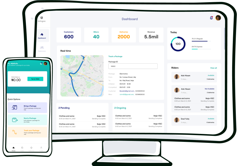
Enabling the African Innovator
In 2019, we were tasked at a hackathon to design a solution to empower African youth. We discovered that the reward-based crowdfunding model that worked so well around the world didn't work across Africa.
I was the design lead that started the audacious project to build a Kickstarter for Africa.

The Challenge
Africa has a youth population of about 200 million, a lot of which haven’t tapped into the full benefits of the digital age. Our goal was to design a tech-enabled solution to boost this enterprising generation’s creativity.
The key requirements to achieve our goal were:
1. Must deal with transactions
2. Must foster innovation
3. Must generate income for the end user
4. Must be easily accessible
5. Should be new to the African market
My Role
- I started the design system as a solo designer in 2019, and later on managed a team of 2 designers to scale it up through the years
- I collaborated with my friends, a frontend developer and a fullstack developer to build the MVP
- I was lead on research, analytics, and collaborated on product management
- I implemented the HTML and CSS of the static pages
- I made design iterations based on user feedback before the application went live in April 2022
- I updated the design direction after the beta testing phase was done
Version One
The Hackathon
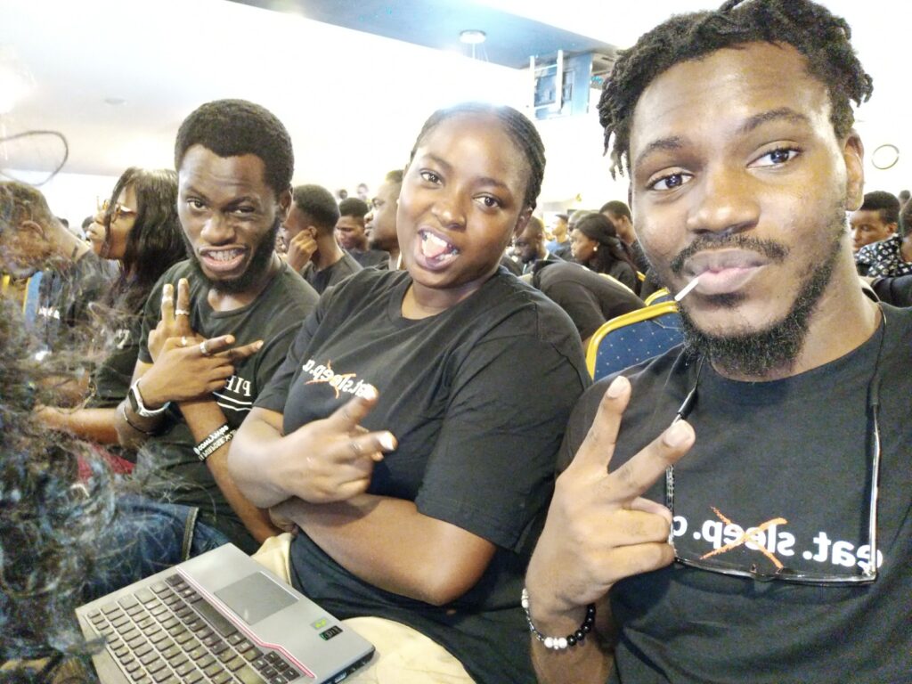
If you’ve ever been to a hackathon then you know how the rush flows! It’s so many ideas that have to be implemented quickly. Through the e-commerce and marketplace ideas, we finally stumbled on something we felt comfortable with – reward-based crowdfunding.
Why reward-based crowdfunding? We realised through some online research that it was a niche that hadn’t fully been explored across Africa. The research showed that crowdfunding of different niches had worked round the world and for some weird reason the most popular reward-based crowdfunding platforms like Kickstarter and Indiegogo didn’t allow people resident in Africa to start campaigns.
Eureka!
We came up with a few screens that prioritised users signing up, creating a campaign, and receiving donations.

Talking to real users
After the peak of the pandemic, we decided to take this idea to the market. The first step was to talk to potential users and get their feedback. This was a tricky product to kickoff because the product has 2 user segments:
– The Creator who starts a campaign)
– The Supporter (who donates to a campaign)
Research method: Physical and virtual interviews
Findings:
– Creators had little to no background knowledge of reward-based crowdfunding
– Supporters were skeptic if their money would be transparently remitted to the Creator
– Supporters were worried about the reliability of the platform to guarantee that the project was executed according to specification
Version Two
The MVP
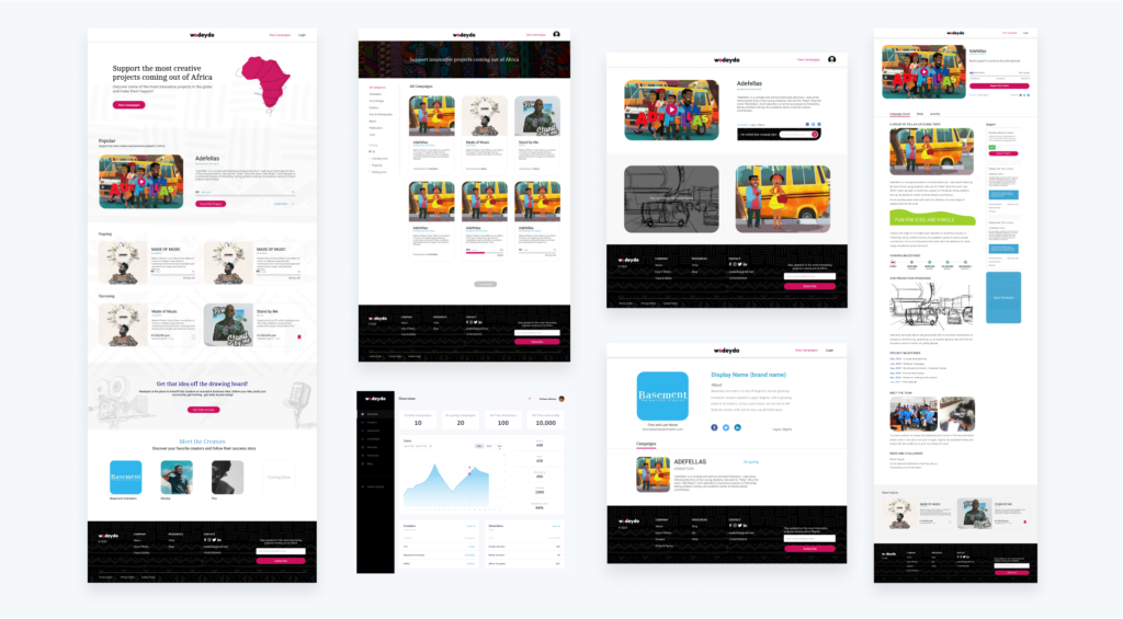
Early access
We decided to give the creators less things to worry about and have closer to a manual onboarding process to kick things off. All the user had to do was fill an early access form and we picked it up from there. The goal was to have good quality control for the beta phase.

Key metrics
One dangerous aspect of a new startup is the temptation to track feel-good metrics like email signups which don’t necessarily convert to success for the business. We were mindful of this at the beginning and set our primary metric as completely funded campaigns. We didn’t realise till we launched however that that seemed more like a goal to aim for than an active metric that was achievable week on week.
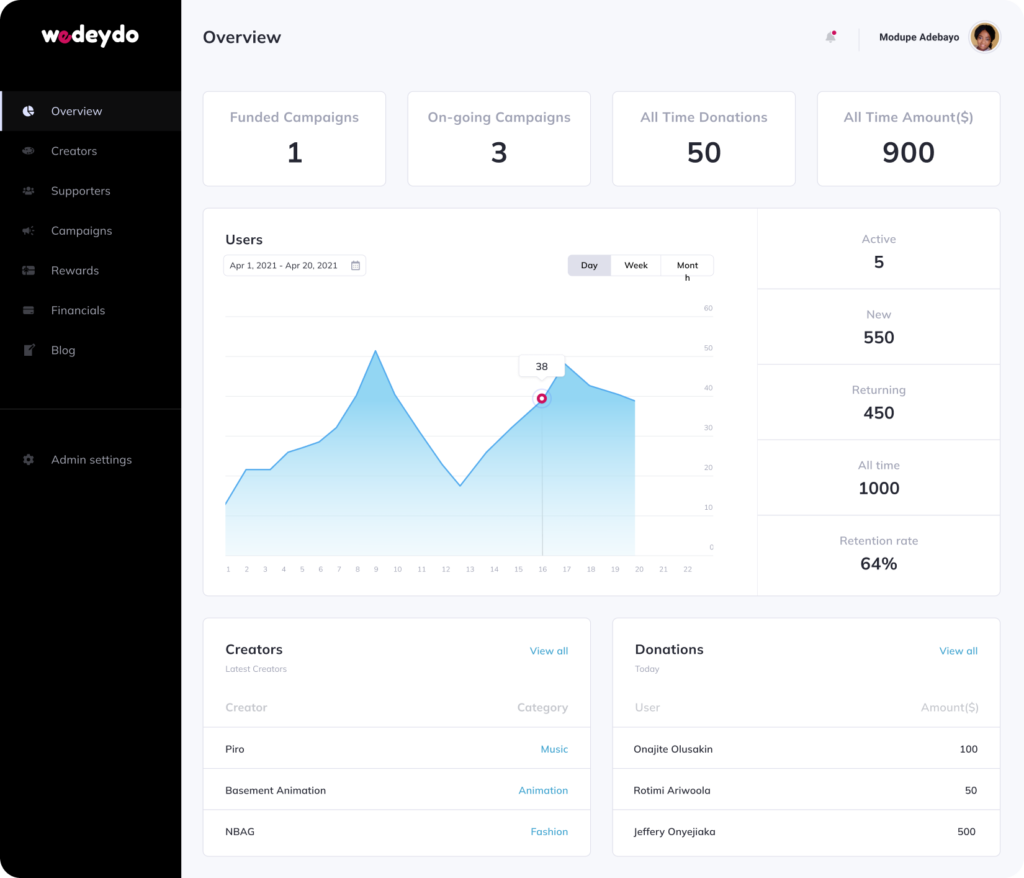
We took a step back to design around smaller scale metrics that could be tracked and optimised weekly:
– Weekly transactions: Number of donations received by a campaign
– Creators onboarded: Number of users ready to have an active campaign
– New supporters: Number of new users donation to a campaign
The campaigning problem
We successfully onboarded the first set of creators with pretty cool projects. Great projects, cool rewards, talks with supporters, amazing interactions, and everyone lived happily ever after right?…

…wrong!
Creators ended up treating the platform like it had automated promotion, they just wanted to set their campaign up, go to bed 😴, and wake up to the magic. Sadly the product itself wasn’t gaining that much traction to convert to donations.
"...how might we help Creators have better campaigns?"
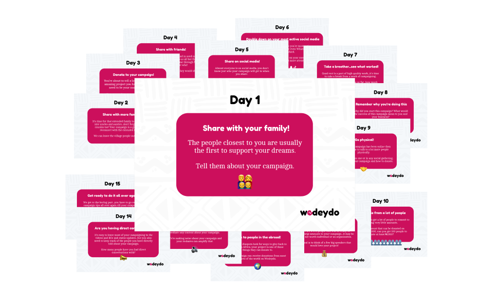
I designed a campaign guide to enable the creators to have a key campaign activity for 15 days, which is the ideal minimum time required to see some traction on a new campaign. Creators that followed the guide saw an increase in supporter responses.
The supporter problem
Recruiting the first round of supporters wasn’t that difficult because of the initial hype and enthusiasm of the launch. A few weeks after the first donations, we started to get feedback on 2 key things:
– Supporters didn’t want a compulsory signup before donating to a campaign
– Supporters outside the country needed to see translated content
The team swung into action and designed around the signup flow for supporters which increase the donations on the platform by over 100%
The first fully funded campaign
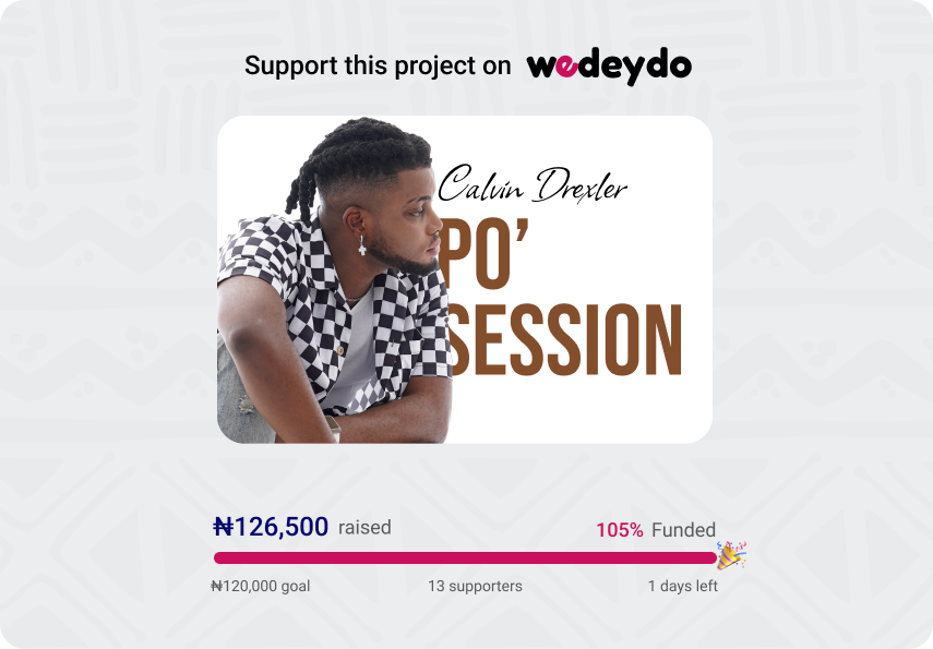
A few live iterations down the line and we finally had a campaign hit past 100% of the goal. The Creator – Calvin Drexler had a relatively smaller financial goal, a shorter campaign time, and high activity through the donation of the campaign.
The next steps
The progress of the product through the beta launch wasn’t exponential but there was some progress. All campaigns posed to have a reward disbursement problem, so education about the reward-based system to both types of users on the platform proved to be paramount. The next design stages will focus on features that could improve the user acquisition rate.
A few features considered for research and design:
– Profile donation links: To enable creators receive donations without an active campaign
– Content creation & sharing: To enable the creators create and share their content faster across major social media platforms
– Creator store: To enable creators sell digital products
– Milestone disbursement: To enable supporters get more transparency on how funds are managed
Version 3 of the app will enable open access to the general public and enable the users to interact on it better. Going forward I wouldn’t be working actively on moving each pixel of the design full-time, instead, I will continue to use the product as a medium to train new designers that I mentor.
Thank you…hope you had a nice read!


