Like most designers and people in tech, I have gone round in many circles just to get to beefing up my portfolio but I never seem to arrive at the sweet spot that my creativity desires. It’s a chicken and egg problem, you need jobs to improve your skills and experience and you need a dope portfolio that shows you have the skills and experience to land jobs. People solve their portfolio problem in different ways and I’m on a journey to solve mine.
I have noticed that I wouldn’t get large chunks of time to get all the designs out of my head, so I have resolved to use every chance I get to flesh something out. The first one up – a stock trading app.
The Brief: Design a stock trading app.
Simple right? Well, when considering the UI/UX for an app, little information on the brief can be a double edged sword. Although it gives room for creativity, that room can lead to an infinite loop of possibilities. First step, define the scope…who am I designing for?
The User: Me 😁
I have a time constraint to get at least 3 pages up in 24 hours. I wouldn’t be doing any extensive research on this one…I’m just hoping up to dribbble to see what’s happening. Ideally I would like to design a mobile and desktop version but I’m new to the stock trading space so it’s not something I can whip up real quick.

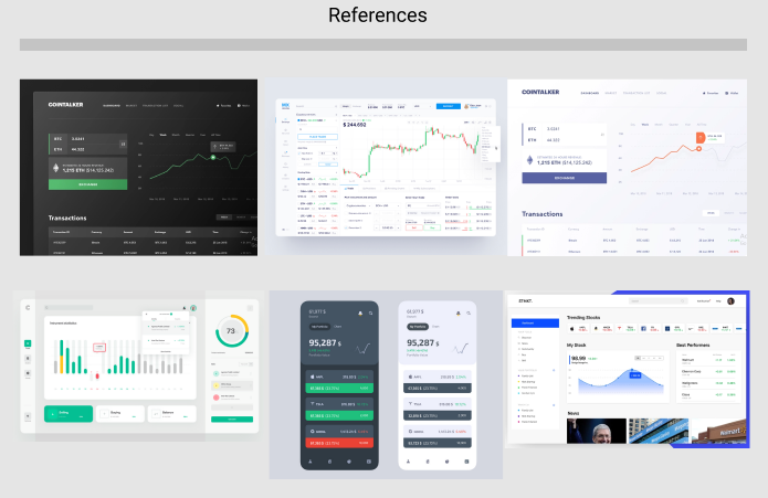
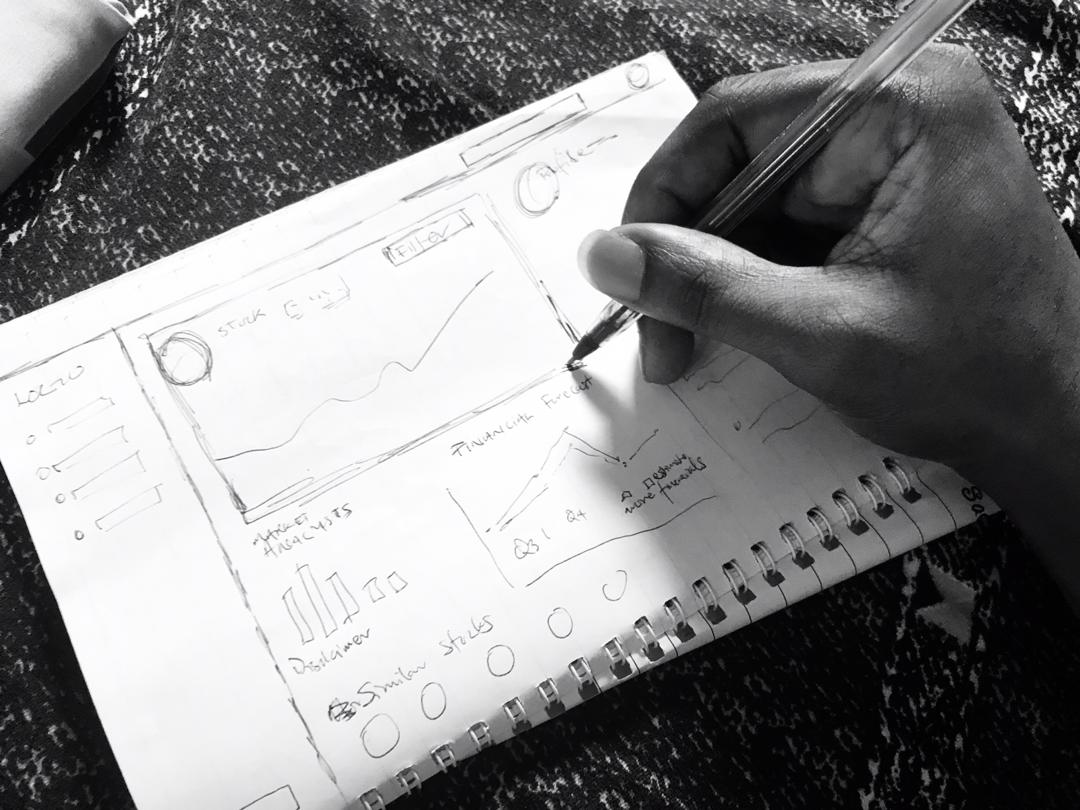
The search for inspiration on dribbble wasn’t functional enough so I had to review some local and international stock trade apps. The KYC needed to register and trade is top class, I wasn’t about to do all that documentation and there was the limitation of location on the international versions. I ended up signing up on 2 platforms to get a feel of a real stock trading app…then the sketches began!


I had two phases of designing, I spent the first 10 hours on research and thinking through the relevant features, slept, then spent about 9 hours designing. Final verdict, this design wouldn’t be making it to my final portfolio but it was a good warm up exercise. Can’t wait for the next one!


Fantastic!